Brand Identity
Specializing in all manner of Illustration and typography, I help bring brands to life with logo design and brand identity. Illustration can bring emotion, humor, and personality to a brand; and while I often practice these skills myself, I am also an experienced art director of illustration, animation, and photography, and I love matching the right artist to a project.


Logo and Illustration
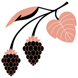
Client - Authored By The Sun / Beauty
Creative Direction - Kristina O'Neal
Logo Design / Illustrations / Animation - Jack Dylan
We Think Sideways
Brief - Conceptualize and animate a series of company values videos for an internal audience of new hires at AvroKO, a luxury architecture and design firm, specializing in hospitality.
Concept - Explore the creative process by deconstructing the basic elements of design; light, shape, and color. A character representing the designer, plums the depths of their imagination, literally diving into the subconscious, passing through a sea of design detritus, to discover the spark of an idea, later put in use as tile for a hotel pool, where it is revealed the designer has been sketching all along.
Client - AvorKo / Architecture, Design & Hospitality
Concept & Animation - Jack Dylan
Script - AvroKo
Logo and Brand Identity
Brief - A brand redesign for an established and highly successful landscape architecture firm, known for projects ranging from luxury urban residences to healing gardens on campuses and hospitals, and large-scale environmental restoration on public lands.
Concept - A balance of the modern and the natural. A simplified apple tree leaf represents the humble potential of nature to transform our lives. It has a rough, hand-drawn feel, which is repeated in the subtext. The contemporary typography of the wordmark connects the brand to the built environment, while the simple underline, grounds it to the "dirt" of its origin.
Client - Dirtworks / Landscape Architecture
Creative Direction - Britt Zuckerman
Logo Design / Brand Guidelines - Jack Dylan
Performance Marketing
Working at start-up speed for Withco, I created an in-house illustration style for a new brand and developed concepts and copy for a highly targeted performance marketing campaign across digital advertising, social, and print. The campaign specifically sought engagement from small business professionals by introducing them to the financial service of a rent-to-own partnership.


(Above) Sketch for an Experiential NYC based pop up
The Key to a Successful Business
Brief - Create the illustration style for a new brand identity, and develop it into a performance marketing campaign.
Concept - Linking success in business with commercial property ownership through a suite of educational ads. A simple illustration style helps convey complex principles in finance, real estate in business, by packaging them in fun, bite-sized lessons, that engage the viewer like a quiz, “Which building is right for your business?". The personality of the illustrated buildings is the foundation for a branded world of business types that can be matched to the target customer's (business owners) unique needs. Another set of conceptual illustrations (visual metaphors), demonstrates the value and benefits of the the brand.
Client - Withco / Tech & Real Estate
Creative Direction - Mark Gardner
Copy, Design & Illustration - Jack Dylan
Experiential & Events
My favorite types of projects are holistic in scope, spanning physical and digital, 2D and 3D. My drawing and writing abilities allow me to communicate concepts quickly and easily with clients and teams, and my hands-on skills in fabrication allow me to design for real life. I love the challenge of creating an entire world for an audience to explore, be surprised by, and hopefully never forget.
(Above) Animatic of Department Store / Speakeasy concept. False signage for a 1920s department store spins and retracts to reveal a speakeasy, complete with decoy items under a glass countertop. Aged wood and signage, with faux windows, plexiglass counters, and props deepen the illusion.
Experiential Bar Booth
Brief - An Experiential bar design for five unique spirit brands at a convention, creating a general theme and equal platform for all, so as not to emphasize any particular brand.
Concept - Six concepts, each allowing for five serving stations. 1. Department Store / Speakeasy. (Video and description above). 2. Heritage. A classic yet contemporary bar design in the spirit of the parent company’s origins. 3. Deco Divine. Elegant Art Deco design with a dash of star power. 4. Spring Station. Inspired by European train stations, and brought to life by vibrant foliage. 5. Step Right Up! A conveyor belt of bottles beckons the brave to try their wrist at an old-fashioned ring toss, letting lady luck determine a prize of one of five fabulous beverages. 6. Mad Modernist. The medium is the message in this deconstruction of brand advertisement. Screens overlap, and bottles clink and pour across panels of TV’s and colored glass. Prominently displaying the five brands and their history in advertisement.
Client - Lyric Agency / Spirits
Creative Direction, Copy, Design & Illustration - Jack Dylan
Strategy - Dan Scofield
Boost Your Experience
Brief - An Experiential activation at an outdoor festival, promoting and educating around the COVID vaccine.
Concept - “Boost the sound, boost your experience.” Inspired by iconic boom box displays, sound bars take shape to form the entranceway of an enhanced musical experience. Guests are greeted by Boost educators, and can then explore their learning path, leading them to an elevated viewing platform. To gain access to (literal) new levels, games will test guests’ knowledge, and encourage them to make a plan to “Get Boosted” with the COVID-19 vaccine. The journey culminates at a soft rock climbing wall, where guests boost themselves up with facts (written on rocks and the wall), that guide their path. The full experience offers numerous touch points of interaction and education that reinforce a commitment to receive the COVID-19 booster. It can also be explored repeatedly and in multiple directions. And while the viewing platform is the enticement, the fun of the journey is the real reward.
Client - Lyric Agency / Pharmaceutical
Creative Direction, Copy, Design & Illustration - Jack Dylan
Strategy & Tagline - Dan Scofield
“Tie One On” with Cutty Sark
Brief - An Experiential activation at an outdoor festival, within a strict 3x3’ space.
Concept - Learn knot tying and the history of Cutty Sark at this interactive freestanding display, with a rotating table top inspired by the ships’ wheel, and capped with a mast for product display and a hidden surprise. Printed illustrations with example knots are displayed under plexiglass, in a wooden display case built to feel as historic as its content. Lengths of rope are retractable from the center for guests to try their hand at knot tying, and the turn-table wheel design adds a tactile sense of adventure. Placed outdoors, the tall display acts as a beacon to the tent area, with adjacent whiskey barrels provided for standing tables, and one other hidden benefit; a cool misting spray that spouts from its top when the wheel is engaged.
Client - Lyric Agency for Cutty Sark / Spirits
Creative Direction, Copy, Design & Illustration - Jack Dylan
Strategy - Dan Scofield
Shine a Light
Brief - 360 design for the agency’s presence at SXSW.
Concept - Shine a Light, by illuminating people and places deserving of applause. Weaving both digital and physical design, this concept winks at SXSW's connection to music and club culture, with a neon sign-inspired motif that extends across spaces. Centered around an invite-only dinner, guests explore an AR-activated map of cultural highlights, where H (The company's logo), both literally and virtually marks the spot, with the presence of a 6ft high neon sign on location, as well as an exhibition and immersive space.
Client - Huge inc / Advertising Agency
Creative Direction, Copy, and Design - Jack Dylan
Creative Direction - Richard Swain
Icon Illustration and Web Design - Sara O.
Augmented Reality - Jullians

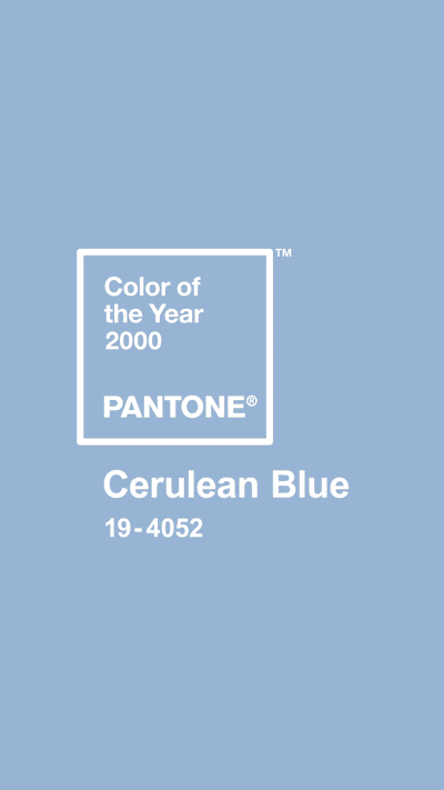
Pantone Color of the Year
Brief - Launching Pantone’s Color of the Year 2020.
Concept - At a launch party hosted by ArtTech House in New York, immersive projectors flood the space with light, color, and a cascade of imagery, for an entrancing experience. Beginning with the previous colors of the year, guests explore the space and exhibition, with themed rainbow cocktails, before the big reveal, "Classic Blue", takes over the room, submerging viewers in a new tranquil and enchanting environment.
Work - Huge inc for Pantone / Advertising Agency
Creative Direction - Stephen Baker
Immersive Projection Design - ArtTech House
Logo Design - Kris Louis
Signage, Art Direction of video, (above right) - Jack Dylan
Animation - Grace Kim
Social Media Management
As the Design Lead on the global comms team at Huge inc, I was responsible for the company’s internal and external brand, events, and social media. I conceptualized, directed animation, and often shot photos and wrote copy for many social campaigns, working closely with stakeholders and ECD’s.


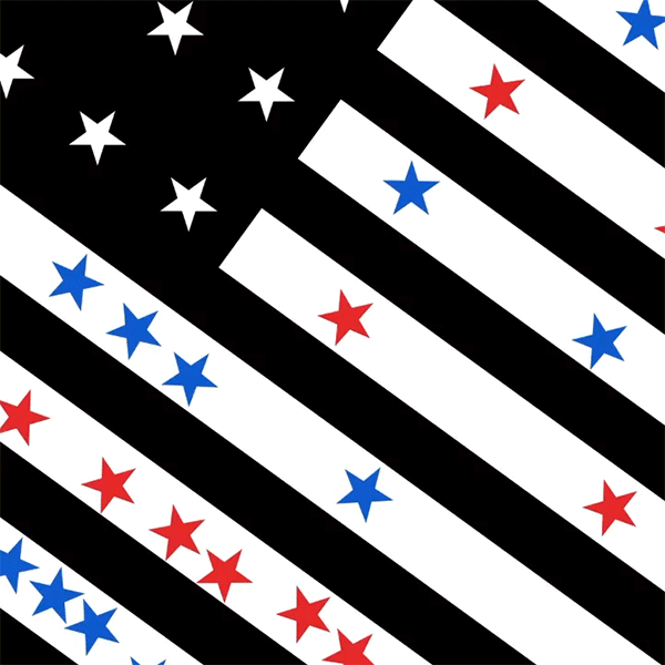

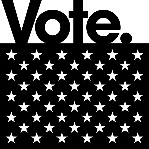
Be The Difference.
Brief - Create a non-partisan social media campaign to drive out the vote.
Concept - A series of connecting animations using blue and red stars to signify votes being cast for the two major parties. Designed to mesmerize the viewer; the stars pass through game-like structures revealed to be a deconstructed American flag. As each small star (or vote), makes its journey through the system, they interact, collide, and eventually tip the scales of an election. The tagline "Be the difference." underlines the message that every vote counts.
Client - Huge inc / Advertising Agency
Concept, Copy, Art Direction - Jack Dylan
ECD - Jason Musante
Animation - Mike Martin

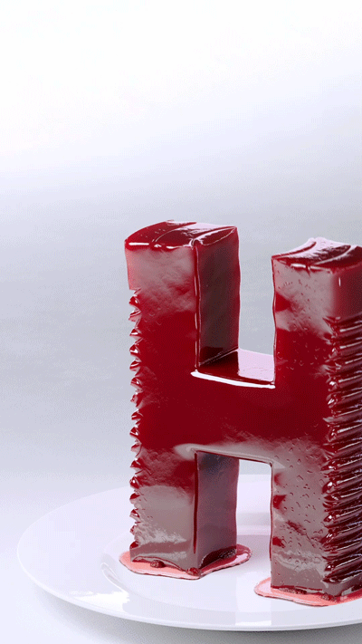

H for all seasons.
Brief - It’s the holidays, but make it Huge.
Concept - Reimagining the company logo in an ever-evolving costume of seasonal styles, the "H" can arrive as grotesque for Halloween, pass into the gelatinous as a side dish for Thanksgiving, and still have enough energy to get down to the countdown on New Year's eve. All while employing a hypnotic, and looping animation style, designed to slow the scroll of any viewer.
Client - Huge inc / Advertising Agency
Concept, Copy, and Art Direction - Jack Dylan
Animation - Mike Martin


Culture and DE&I
Brief - Celebrating people and our values throughout the year.
Concept - A mixture of graphic, photographic, video, and illustrative solutions, designed to keep “the grid” fresh, rhyming but not repeating. This important part of brand identity meant working closely with affinity groups to hone and amplify their message while also ensuring brand integrity and ingenuity across the calendar year.
Work - Huge inc / Advertising Agency
Credits - Click images for details
Concept, Copy, Art Direction, Animation - Jack Dylan